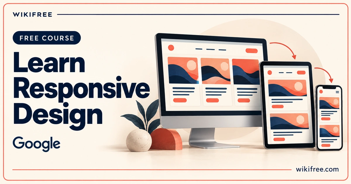
A website should feel considered whether someone opens it on a phone, enlarges the text or navigates with a keyboard. Learn Responsive Design, Google’s free written course on web.dev, helps you connect those experiences through practical HTML and CSS decisions. Its value goes beyond fitting a desktop layout onto a smaller screen: you explore how content, components and interactions can respond to the people using them.
If you already understand basic markup and styling, this course offers a focused way to make your next page more adaptable. The lessons combine explanations, demonstrations and self-assessments, so you can investigate a technique and then try it in your own small example.
Course at a glance
| Provider | |
|---|---|
| Platform | web.dev |
| Level | Beginner |
| Language | English |
| Format | Self-paced written course with demos and self-assessments |
| Prerequisites | Basic HTML and CSS; JavaScript is not required |
| Access | Free public lessons and independent browser/text-editor practice |
| Recognition | Learn Responsive Design developer-profile badge offered after completion confirmation |
| Accounts | No account needed to read; free standard developer profile for the badge |
What you’ll learn
- Adapt page layouts: use CSS media queries and flexible layout techniques when the available space changes.
- Design reusable components: explore grid, flexbox and container queries for components in different contexts.
- Improve reading and imagery: consider typography, responsive images, the picture element and scalable icons.
- Respect user preferences: investigate theming and media features rather than assuming every visitor wants the same presentation.
- Support different interactions: account for keyboard, mouse and touch alongside accessibility considerations.
- Prepare for varied audiences: examine language, writing direction and adaptable interface patterns.
Skills you’ll gain
- CSS media queries
- Responsive layouts
- Flexible components
- Responsive images
- Adaptive typography
- Inclusive interface design
Think in components as well as screens
A page may have enough room for a wide layout while an individual card sits in a narrow sidebar. The micro-layout material helps you recognise that distinction. Grid and flexbox can handle flexible arrangements, while container queries let a component react to its own available space.
This is useful when a design element appears in more than one place. Instead of treating every placement as a separate redesign, you can work towards a component that remains readable in different containers. That does not remove the need for testing; it gives you a clearer starting point for it.
Make the content easier to use
The image lessons connect visual presentation with delivery. You explore ways to keep media inside its container, preserve proportions and offer appropriate image resources. Typography adds another layer: a layout that technically fits can still be uncomfortable to read.
Interaction and accessibility broaden the question further. A small screen does not reliably tell you whether someone uses touch, a keyboard or another input method. Following those lessons encourages you to examine how the interface behaves, rather than judging it only from a screenshot.
Practise with one adaptable page
For optional independent practice, build a simple page containing a heading, navigation, an image and a few cards. Use your own text and images. Start with a narrow window, then gradually widen it and observe where the content becomes awkward.
Try a flexible card arrangement before adding breakpoints. Place the same card in a narrower container, enlarge the text and navigate through links using the keyboard. Record the problem you notice, change one relevant rule and compare the result. This is a personal exercise, not a provider assignment or an accessibility certification.
A browser, its built-in developer tools and an ordinary text editor are enough for this local practice route. Embedded demos can be useful, but reproducing small examples locally keeps your work independent of an online editor account.
Free access and recognition
You can read the public course without signing in. The lessons and local HTML/CSS practice do not require paid software, hosting, a subscription, a payment card or a trial. The course is self-paced; no fixed total completion time was verified.
The completion page offers a Learn Responsive Design badge after you confirm completion. A standard Google developer profile is available at no cost. This is profile recognition, not a formal certificate, academic credit or a guarantee that every website you build will meet all accessibility requirements.
Frequently asked questions
Do I need JavaScript before starting?
No. The provider says basic HTML and CSS are sufficient. You should be comfortable reading simple markup and style rules before beginning.
Is responsive design only about phone screens?
No. This course also considers user preferences, input methods, language, typography and component contexts alongside screen sizes.
Can I study without paying for an editor?
Yes. Read the public lessons and practise with local HTML/CSS files, a browser and a free text editor. An optional free developer profile is used for the offered badge.
Questions & discussion
Share a useful question or correction. Comments appear after moderation. Please avoid personal or sensitive information.